Step 1: Create a Copmonent in framer with this code and use it in framer
import { Frame, addPropertyControls, ControlType } from "framer"
// Function to copy the Figma data to the clipboard
const copyFigmaToClipboard = (figmaCode) => {
const htmlData = `
<html>
<head>
<meta http-equiv="content-type" content="text/html; charset=utf-8">
</head>
<body>
<!--StartFragment-->
${figmaCode} <!-- Dynamic Figma component data goes here -->
<!--EndFragment-->
</body>
</html>
`
const blob = new Blob([htmlData], { type: "text/html" })
const item = new ClipboardItem({ "text/html": blob })
navigator.clipboard
.write([item])
.then(() => {
console.log("Figma component copied to clipboard!")
alert("Figma component copied to clipboard!") // Let the user know it worked
})
.catch((err) => {
console.error("Failed to copy:", err)
alert("Failed to copy Figma component.")
})
}
// The actual button that will trigger the copy action
export function CopyFigmaComponentButton({
figmaCode,
buttonFontSize,
buttonPadding,
buttonBorderRadius,
buttonBackground,
buttonColor,
hoverBackground,
fontType,
svgIcon,
iconToggle, // Renamed property for icon toggle
}) {
// Split padding into individual values
const paddingValues = buttonPadding
.split(" ")
.map((p) => `${p}px`)
.join(" ")
// Define CSS styles for the button using property values
const buttonStyles = {
fontSize: buttonFontSize,
padding: paddingValues, // Use combined padding
borderRadius: buttonBorderRadius,
background: buttonBackground,
color: buttonColor,
border: "none",
cursor: "pointer",
transition: "background 0.3s ease",
display: "flex", // Use flex to center content
alignItems: "center", // Center text vertically
justifyContent: "center", // Center text horizontally
width: "100%", // Make button fill the container width
height: "100%", // Make button fill the container height
fontFamily: fontType, // Apply font type
}
return (
<Frame
width="100%" // Allow frame to fill the container
height="100%" // Allow frame to fill the container
background="none" // Remove the outer background
center
style={{ padding: 0 }} // Center content without padding
>
<button
onClick={() => copyFigmaToClipboard(figmaCode)} // Pass the dynamic data
style={buttonStyles}
onMouseEnter={(e) =>
(e.target.style.background = hoverBackground)
} // Change background on hover
onMouseLeave={(e) =>
(e.target.style.background = buttonBackground)
} // Reset background when not hovered
>
{iconToggle && svgIcon && (
<span
dangerouslySetInnerHTML={{ __html: svgIcon }}
style={{ marginRight: "8px" }}
/>
)}{" "}
{/* Render SVG icon only if iconToggle is true */}
Copy to Clipboard
</button>
</Frame>
)
}
// Add property controls for the figmaCode and button styles
addPropertyControls(CopyFigmaComponentButton, {
figmaCode: {
type: ControlType.String,
title: "Figma Code",
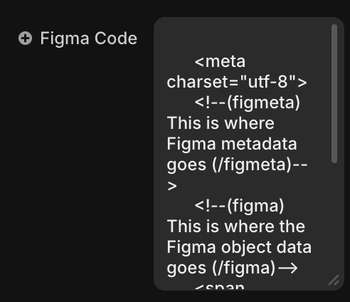
defaultValue: `
<meta charset="utf-8">
<!--(figmeta) This is where Figma metadata goes (/figmeta)-->
<!--(figma) This is where the Figma object data goes (/figma)-->
<span style="white-space:pre-wrap;">This is some text in the Figma component!</span>
`,
displayTextArea: true,
},
buttonFontSize: {
type: ControlType.Number,
title: "Font Size",
defaultValue: 16,
min: 10,
max: 50,
},
buttonPadding: {
type: ControlType.String,
title: "Padding (top right bottom left)",
defaultValue: "10 20 10 20", // Default padding values
},
buttonBorderRadius: {
type: ControlType.Number,
title: "Border Radius",
defaultValue: 5,
min: 0,
max: 50,
},
buttonBackground: {
type: ControlType.Color,
title: "Background Color",
defaultValue: "#09f",
},
buttonColor: {
type: ControlType.Color,
title: "Text Color",
defaultValue: "#fff",
},
hoverBackground: {
type: ControlType.Color,
title: "Hover Background Color",
defaultValue: "#0073e6",
},
fontType: {
type: ControlType.String,
title: "Font Type",
defaultValue: "Arial, sans-serif", // Default font type
},
svgIcon: {
type: ControlType.String,
title: "SVG Icon",
defaultValue:
"<svg xmlns='http://www.w3.org/2000/svg' width='16' height='16' fill='currentColor' class='bi bi-clipboard' viewBox='0 0 16 16'><path d='M3.5 0a.5.5 0 0 1 .5.5V1h9V.5a.5.5 0 0 1 1 0V1h1a1 1 0 0 1 1 1v13a1 1 0 0 1-1 1H1a1 1 0 0 1-1-1V2a1 1 0 0 1 1-1h1V.5a.5.5 0 0 1 .5-.5z'/></svg>", // Default SVG icon
displayTextArea: true,
},
iconToggle: {
type: ControlType.Boolean,
title: "Show Icon",
defaultValue: true, // Default is to show the icon
},
})
Step 2: Copy any file from figma and paste on clipboard inspector
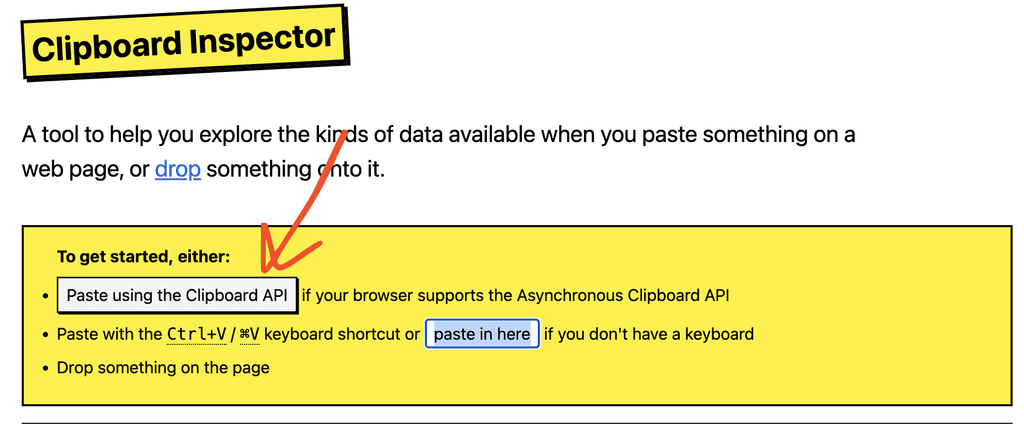
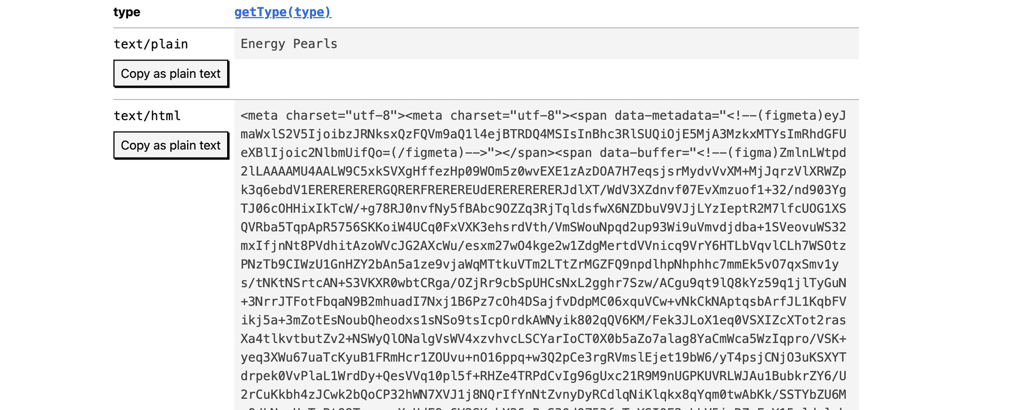
Step 3: Copy only (text/html)
Step 4: Paste it in Figma Code Field of the Component made in Step 1
Thats it you can use the button to copy paste Figma stuff
Do follow me on X if this helps
Jay Dwivedi
Follow in X